
A site plan can look straightforward until we start following the journeys through it. The main entrance needs a clear arrival. The emergency drop-off needs its own approach. Parking and service access need to connect somewhere. Each decision may make sense on its own, but put them together and the conflicts start to appear.
This is what I have been exploring with the driveway generator in PLANNR. I want to place an access point, move a drop-off or change an assumption and see what that does to the whole arrangement, while the plan is still open to change.
I can start by placing the nodes, then adjust the conditions around them. The generated roads show one possible arrangement; the flow diagrams and moving vehicles help me see where it gets awkward. I want those checks close enough to the drawing that we can try a suggestion while we are discussing it.
Putting intentions on the canvas
A node is a small way of saying what we want to happen. This is where visitors arrive. This drop-off serves the emergency department. This connection leads to parking. Its position matters, and so does the role we give it.
Two entrances might need separate circulation, or they might share part of a road. A parking ramp may belong to the same access system as the main drop-off without serving the same purpose. The generator needs to retain those distinctions.
The canvas gives people something concrete to discuss. Someone can suggest moving a drop-off, another person can question its approach, and the revised arrangement can be tested. A proposal becomes visible before everyone has to agree that it is the answer.
That is the collaborative element I want PLANNR to support. The tool helps explore what follows from a choice, while people bring the reasons for making it. Why should these arrivals remain separate? Which conflict deserves attention first? Sometimes answering those questions means changing the brief as well as the drawing.
Parameters give us something to test
Road width, turning radius, building clearance and queue allowance affect how much space an arrangement needs. Changing one can alter relationships elsewhere on the site. A compact drop-off may need more queue space; increasing clearance at a building corner may push the road closer to the site boundary.
The controls should help us understand these consequences. Adjusting a parameter becomes a planning question: what happens if demand grows here, or this movement needs more space? The resulting layout gives us something to compare with the previous option.
The recent tests showed why generation still needs human review. Two nearby drop-offs were plausible in isolation, but their combined arrangement became oversized and confused. My sketches clarified what I wanted: compact returns alongside one another, each keeping the space required by its own queue.
That back and forth is useful. I try an arrangement, look at what the generator makes of it and decide what to change. Sometimes the inputs are wrong. Sometimes it is the rule that needs another look.
Follow the movement
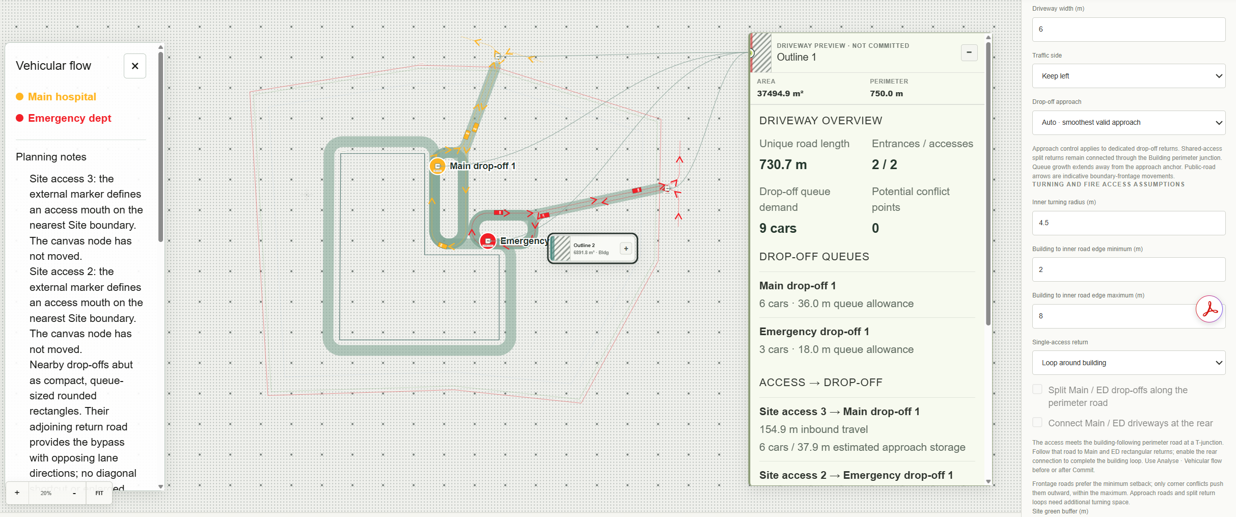
A road outline shows where space is reserved. Flow diagrams let us follow an arrival from the gate to its destination and back out again. Places where journeys cross or share a stretch of road become easier to inspect.
In this preview, the Main and ED movements are distinguished in yellow and red. Their routes can be read alongside the road arrangement, with the assumptions and planning notes still visible. We can discuss a particular journey without losing sight of the rest of the site.
Vehicle animation adds a sense of sequence: arrive here, turn there, pass another movement, then leave. Watching that sequence can draw attention to potential clashes that are less obvious in a static drawing. The screenshot captures its vehicle markers; the moving view provides the additional check over time.
One correction showed why this matters. Checking road centerlines had missed conflicts in the offset lane paths. Following the movement more closely changed what needed testing. These remain schematic checks, rather than certified swept-path or traffic-capacity analysis, but they can help direct the next round of review.
Give the analysis something to say
I also want to be able to explain why I prefer one option. The screenshot now shows unique road length, entrances and accesses, queue allowances, potential conflict points and an access-to-drop-off travel distance. These give the discussion more substance than an impression that one layout looks better.
For example, the displayed queues allow six cars at the main drop-off and three at ED. Those assumptions can be questioned alongside the space they occupy. The reported inbound travel distance gives us another way to discuss how directly a destination is reached.
An allowance is still an input, not a prediction of waiting time. Likewise, a zero in the conflict counter describes what the current checks detected. The numbers need that context if they are going to inform decisions honestly.
I would like to carry these measures into clearer option comparisons. One arrangement might use less road but make an important arrival less direct. Another might separate movements more clearly while taking up more land. A small set of understandable measures can help a team explain what improved, what was sacrificed and what still needs work.
Keep the workflow together
The direction for PLANNR is to keep these activities close: place the nodes, set assumptions, generate an option, inspect movement, discuss the measures and revise the plan.
If each step requires rebuilding information elsewhere, the discussion loses momentum. A changed entrance should carry through to its routes and analysis, so everyone is considering the same proposal.
There is more to develop, particularly in comparing options and handling complex combinations of arrivals. Human review remains essential when an arrangement satisfies the checks but misses the intended relationship.
I want us to catch these conflicts while there is still room to do something about them. If we can move an entrance, test the routes and discuss the numbers in the same place, it should be easier to understand why the plan ended up the way it did.